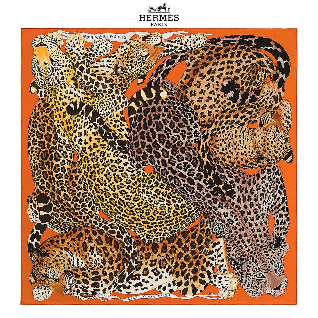
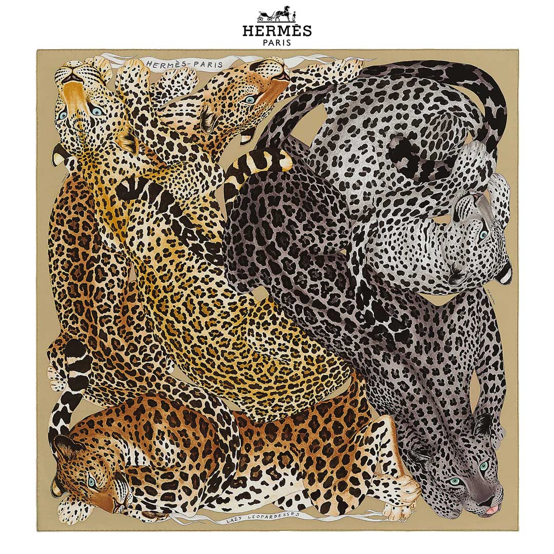
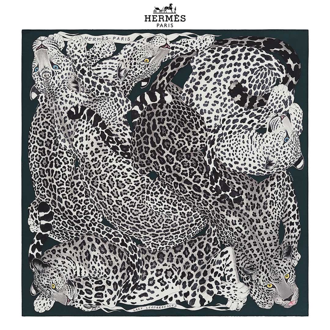
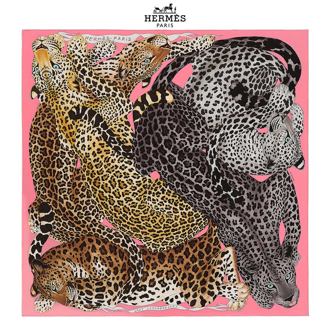
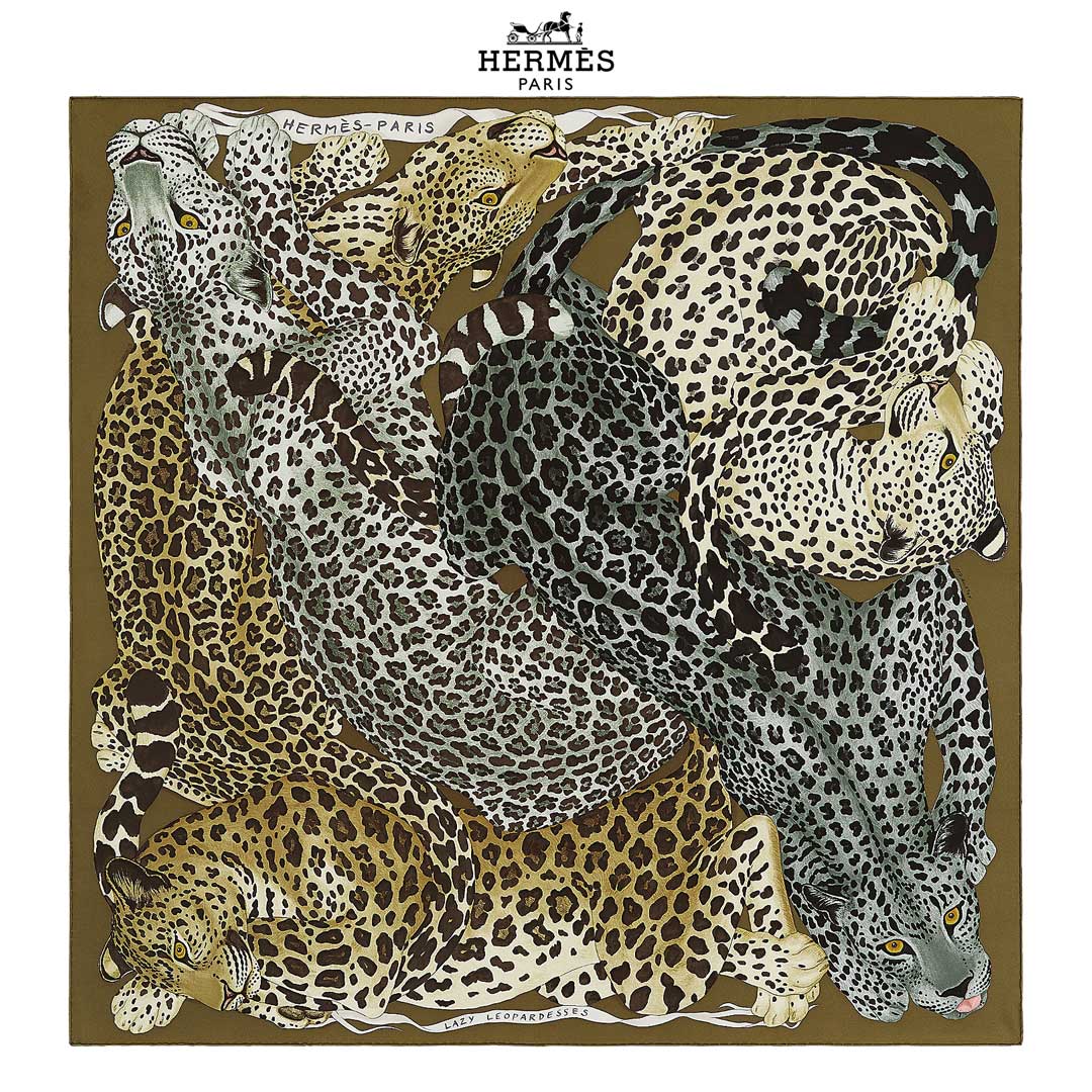
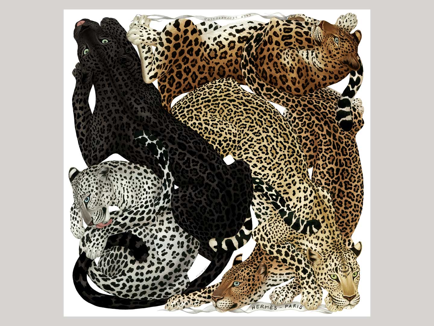
‘Lazy Leopardesses’ for Hermès Paris, AW21
This design was one of the winners of the Hermès Grand Prix du Carré scarf design competition, held in 2019/20. It won 3rd prize out of 5500 entries.
Further below you can see work in progress images of the artwork, and here I’m listing some info about the leopards on the design, as well as why I chose leopards for this scarf:
‘LAZY LEOPARDESSES’ features five subspecies of leopards, all of them threatened or critically endangered. Whilst leopard prints are popular all over the world, the animals’ habitat has decimated and many varieties are on the brink of extinction.
Leopards exist in many areas throughout Asia and Africa, and only the African subspecies is not currently endangered.
Some species can have black individuals, this is just a different pigmentation and not a separate species. These ‘black panthers’ can be common in dense forest areas.
The following Leopards feature on the scarf (notice some differences in the spots and shades):
AMUR LEOPARD panthera pardus orientalis (on scarf: head bottom left)
Native to southeastern Russia and northern China.
Listed as Critically Endangered on the IUCN Red List
ARABIAN LEOPARD panthera pardus nimr (on scarf: curled up top right)
Native to the Arabian Peninsula.
Listed as Critically Endangered on the IUCN Red List
INDOCHINESE LEOPARD panthera pardus delacouri – here in darker pigmentation (on scarf: head bottom right)
Native to mainland Southeast Asia and southern China.
Listed as Critically Endangered on the IUCN Red List
JAVAN LEOPARD panthera pardus melas (on scarf: head top middle)
Native to the Indonesian island of Java.
Listed as Critically Endangered on the IUCN Red List
SRI LANKAN LEOPARD panthera pardus kotiya (on scarf: head top left)
Native to Sri Lanka.
Listed as Vulnerable on the IUCN Red List
I chose the leopard as an icon. We perceive the elegant, gracious cat as strong and independent, yet also serene, relaxed, so self assured and tranquil.
And of course, there’s the leopard’s coat with its sublime pattern: extraordinary, mesmerising, a bit ostentatious even, and all this with the feeble excuse to act as camouflage!
No wonder we keep borrowing the leopard’s beautiful pattern for dress or decoration, it lends an air of the exotic, sumptuous, enigmatic, mysterious, with a touch of the wild and unpredictable.
In this instance I chose to depict leopardesses, to honour the often under-appreciated strength, grace and creative force of the female.
In our fleeting existence we’re always looking for the essence, the mystery, the timeless truth – but we mostly just grasp at ephemeral shapes and concepts, at what appears so luminous, yet slips back into the infinite haze of forms at the blink of an eye.
The timeless elegance of the leopard keeps its magical power, she is no victim of trends.
In the current times, classic style icons like the leopard have even more appeal, as we’re all realising that chasing trends doesn’t bring much satisfaction and damages our beautiful planet.
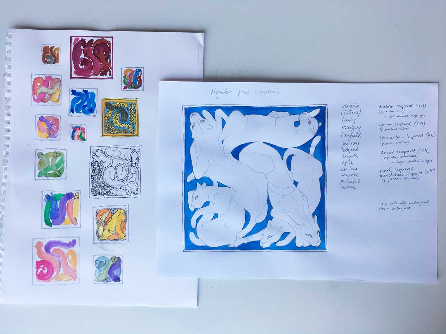
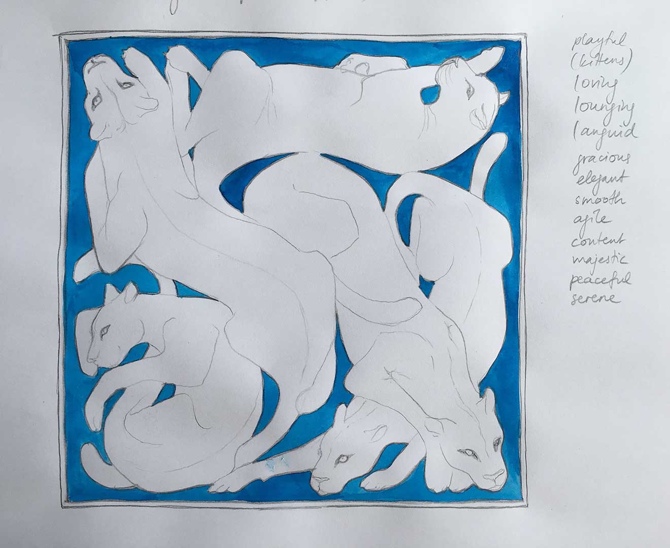
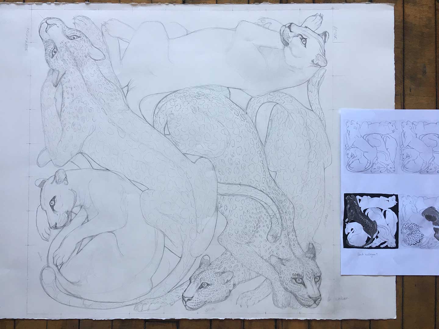
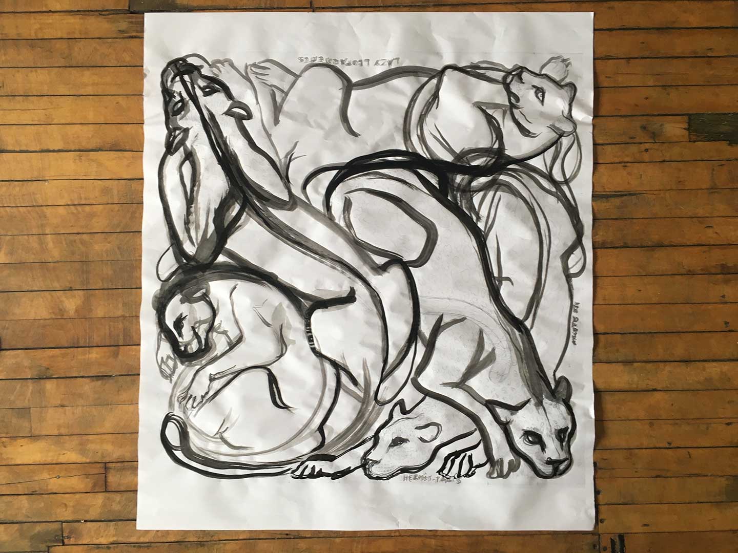
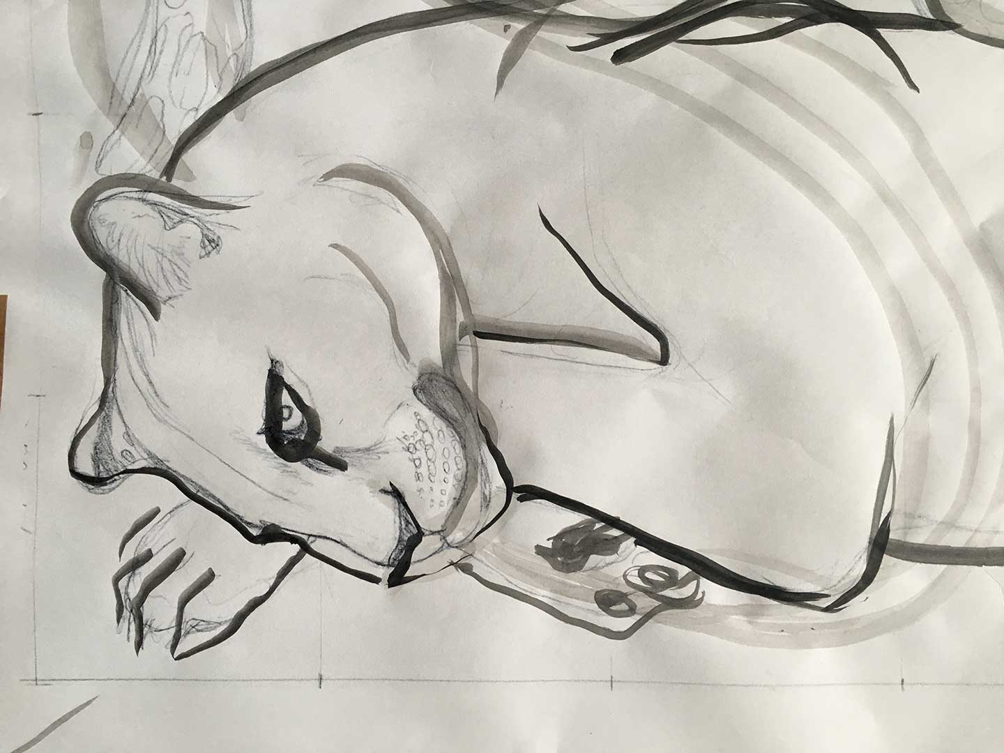
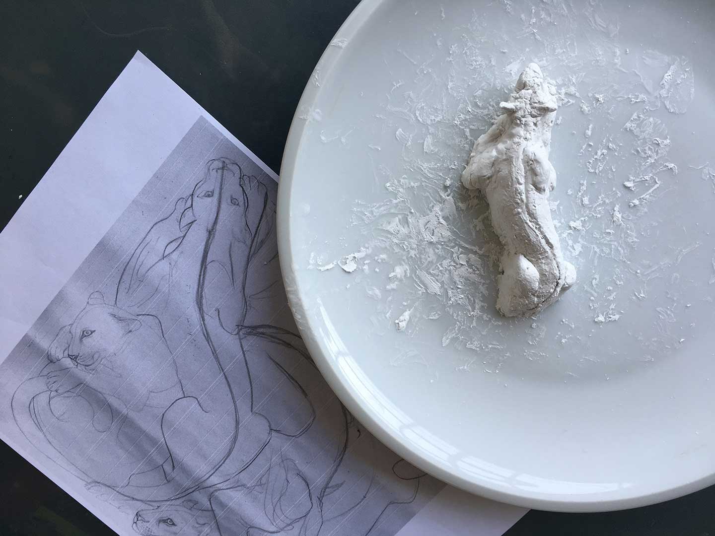
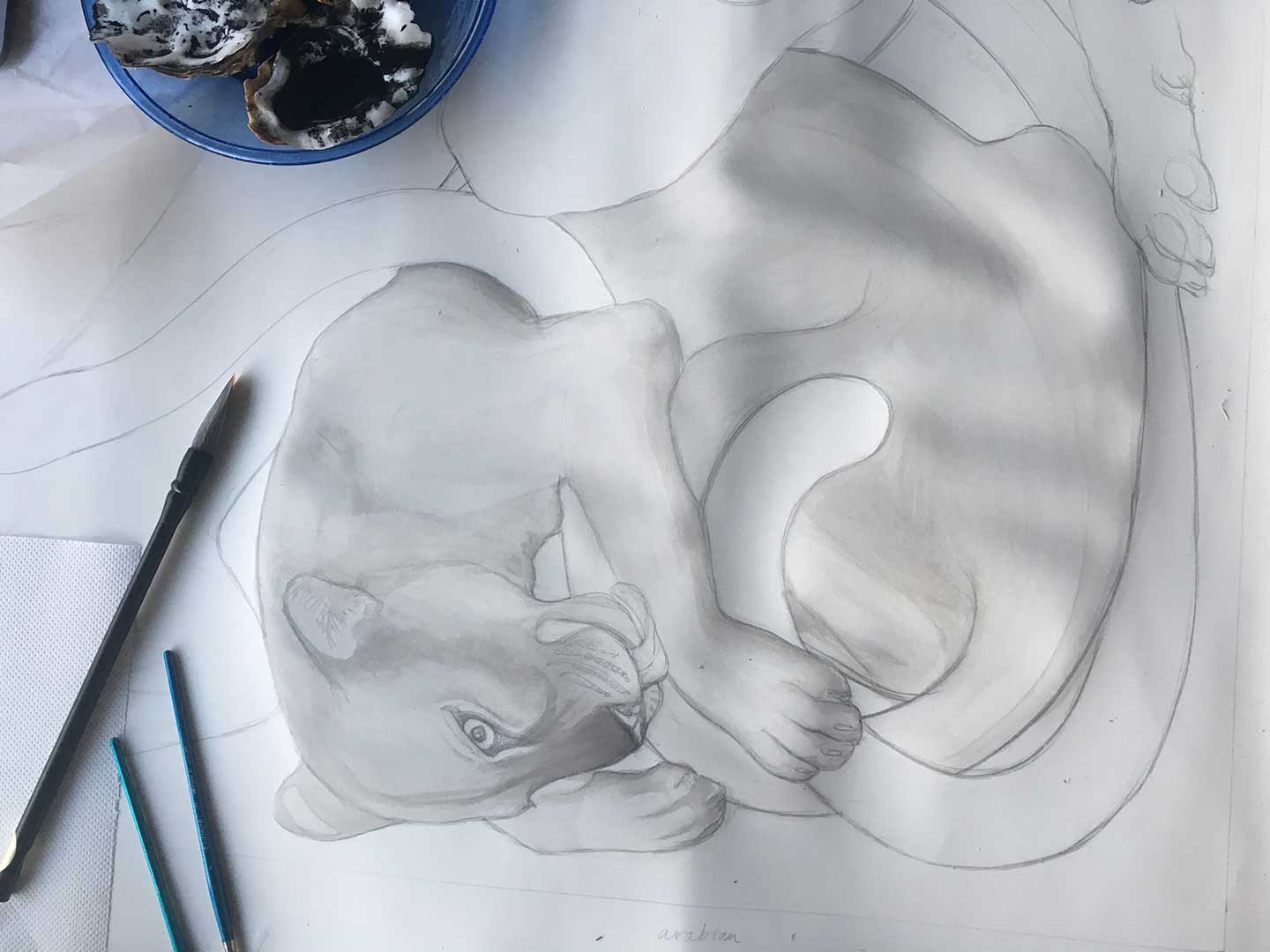
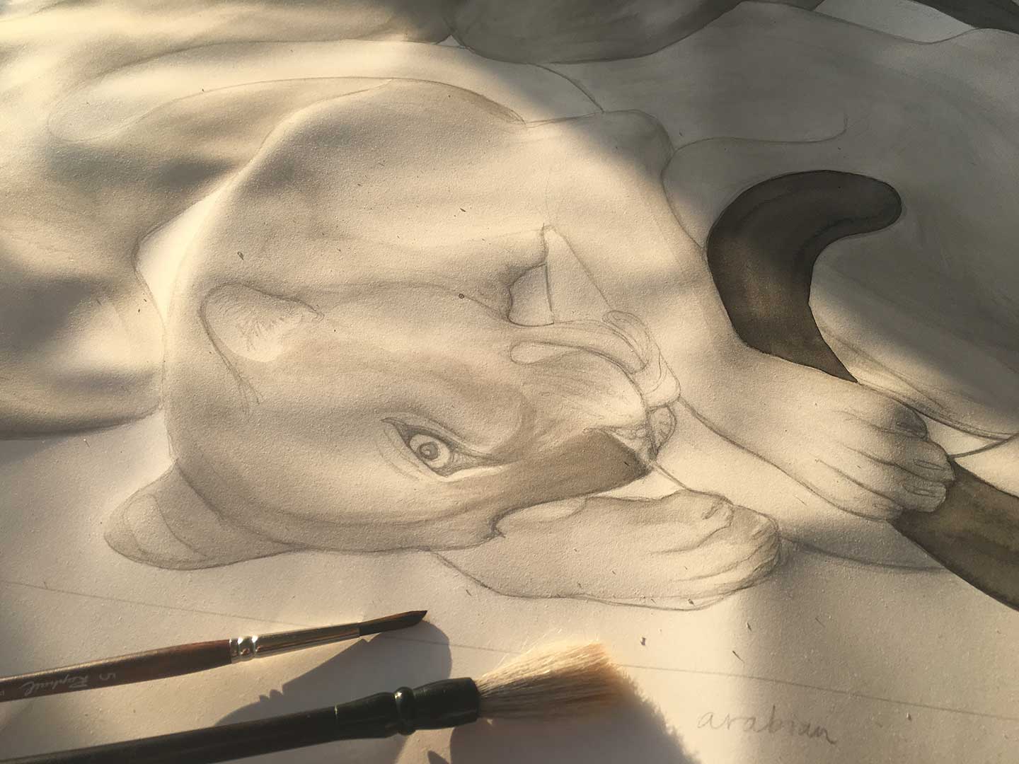
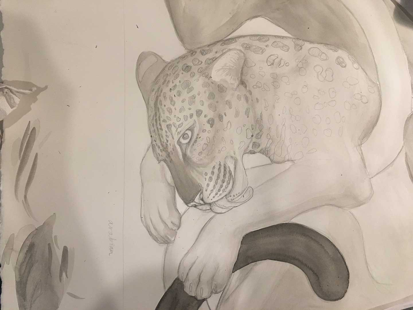
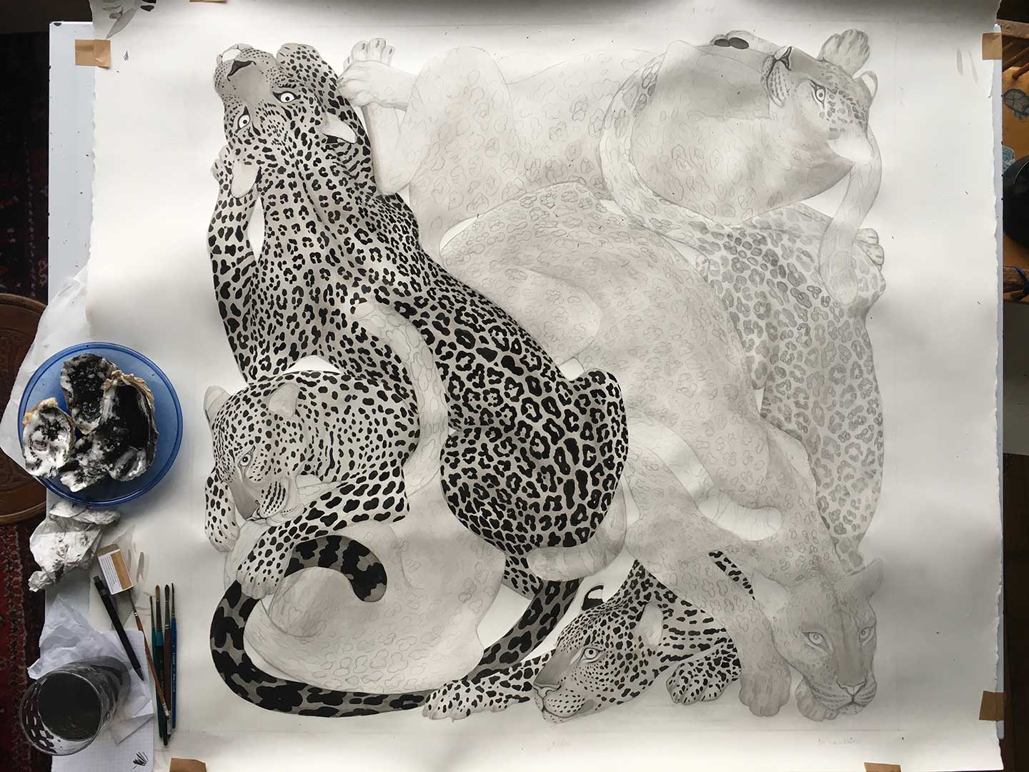
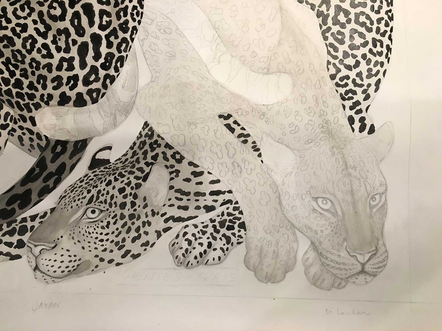
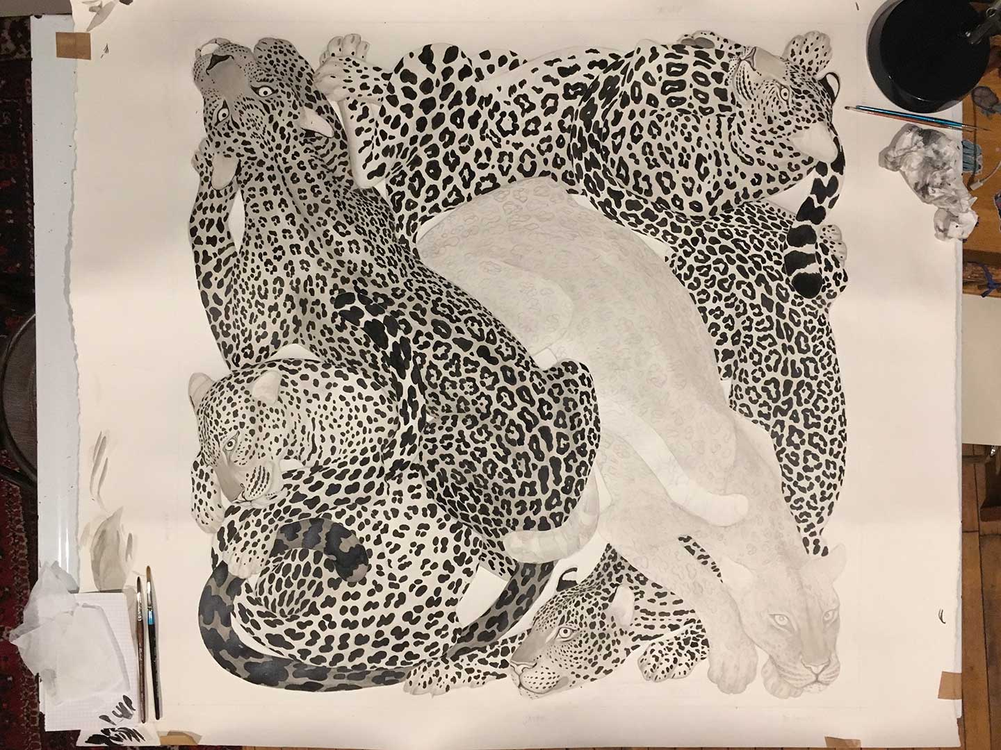
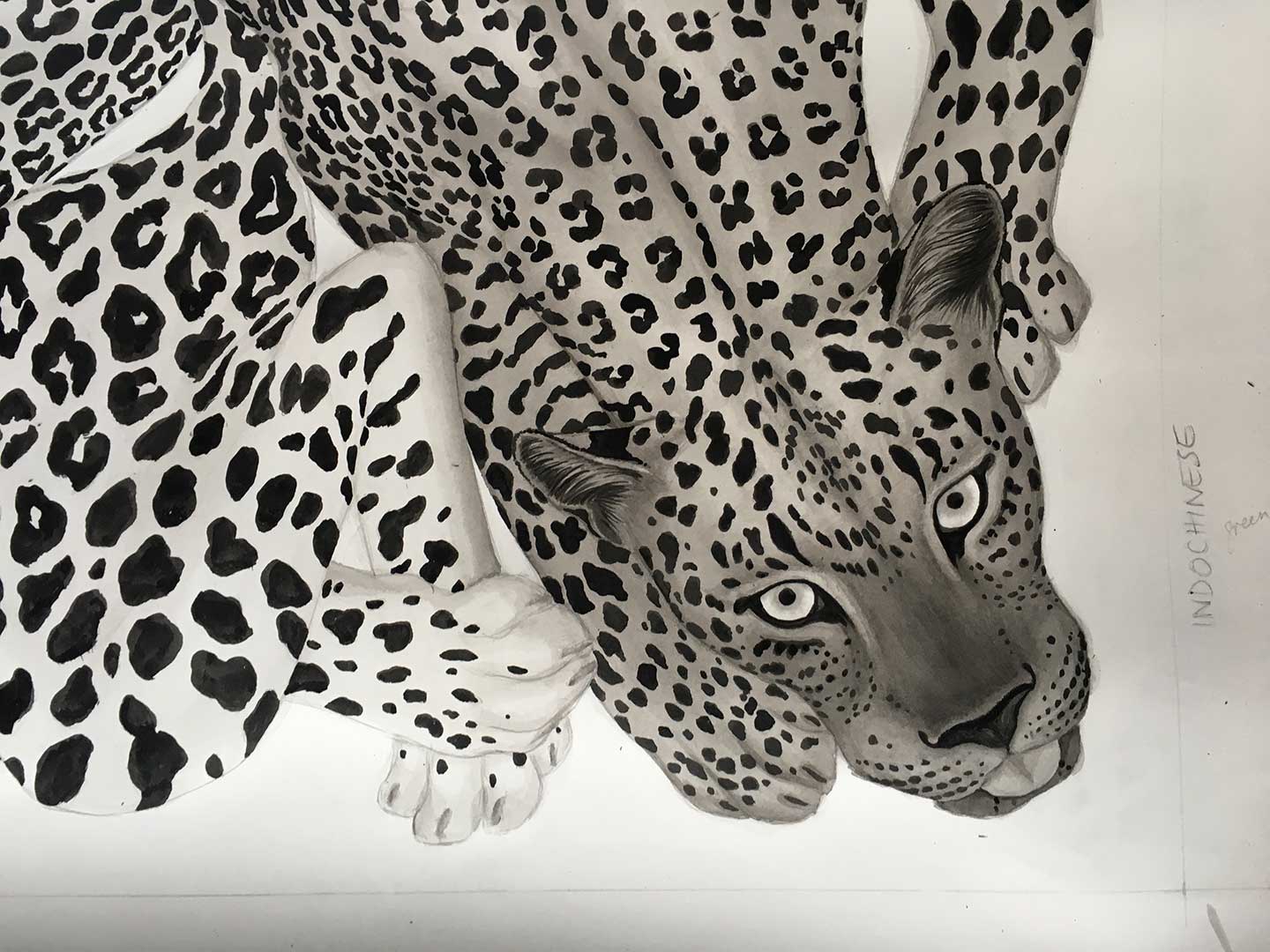
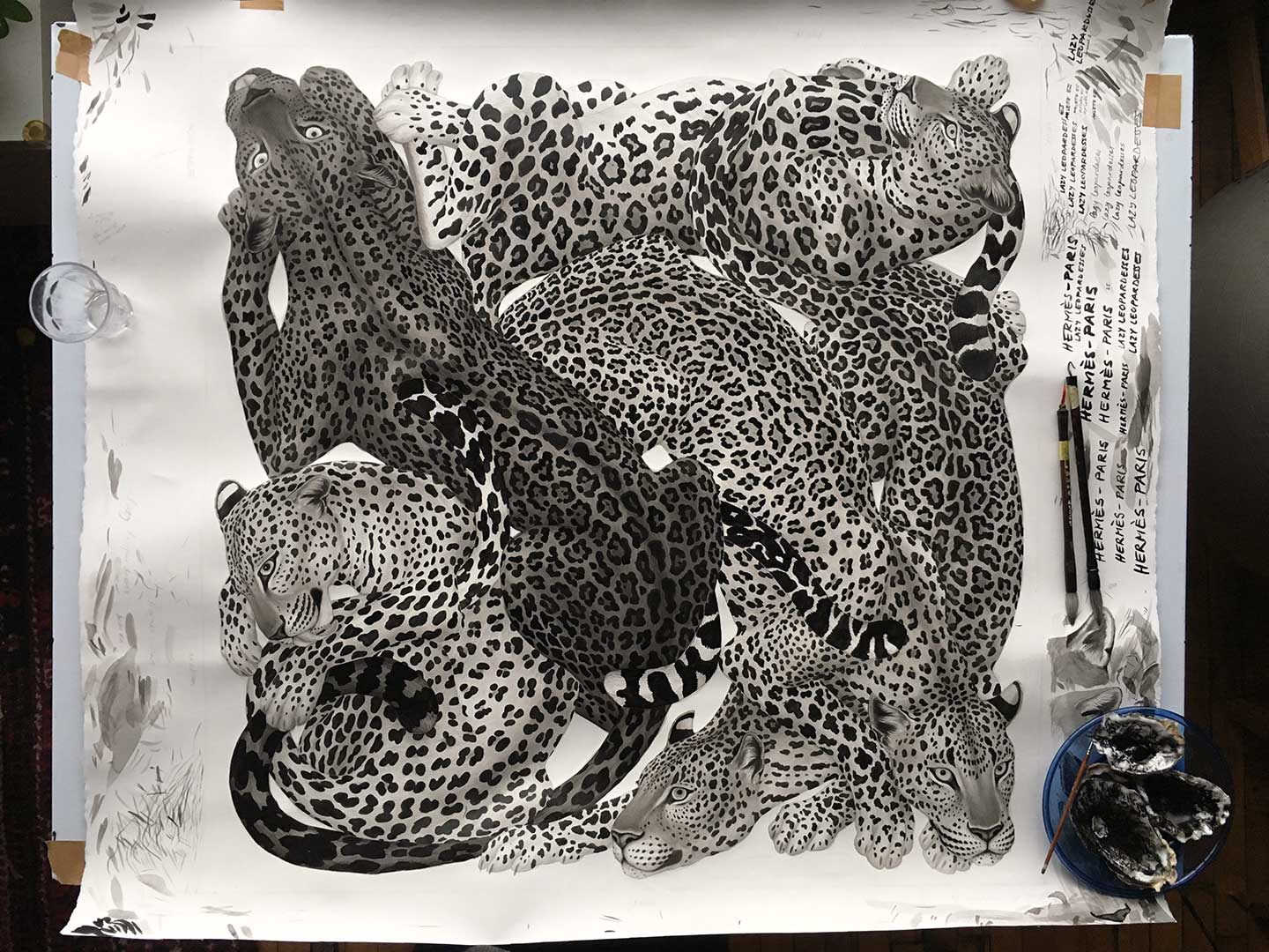
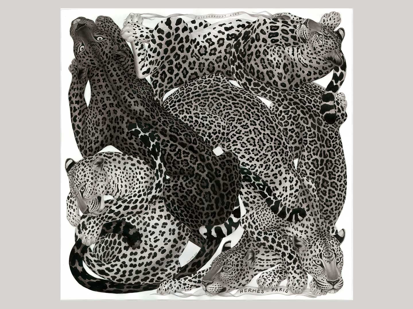
These are some images of the work in progress, as well as the finished artworks I sent to Hermès (one in black and white, one where I added colour).
At the beginning I always spend a lot of time thinking about the composition. The little coloured minisketches are some of the early trys. On the first raw composition (blue background) I wrote the mood I wanted to create with the finished piece.
I then did lots of sketching of Leopards in different positions, to understand their shapes and movements (no images). It’s sometimes very hard to get this accurate from photographs and videos, which never show all the angles. I couldn’t quite figure out how the animal would look from above when lying and curved, especially the shoulder blades and hind legs, so I made a (rather unsophisticated) clay model to have a better idea – kids clay at hand : )
After making a smaller scale composition sketch, I printed a few copies in large scale and drew on it with calligraphy brushes and ink to see if I can optimise the flow of the shapes. (This step is so enjoyable as there is no pressure to get it ‘perfect’, it’s just the joy of the flow!)
I then re-drew the finished composition with pencil onto thick aquarelle paper, on which I worked with layers of diluted Indian ink. This is the medium I have been using for most of my artworks. It is waterproof once on paper, so it’s quite unforgiving when it comes to mistakes, but I just love the no-nonsense simplicity of it, and the beautiful shading it can create. On one of the images you can see the undulating paper in the early morning sun.
For the spot patterns, I paid meticulous attention to stay true to nature for each of the animals. In nature, no two leopards have exactly the same spot pattern, but there are noticeable differences in spot sizes and shapes between some of the subspecies.
For the faces, I tried my best to make the leopardesses friendly, playful and gentle, so they can feel like trusted companions on the wearer’s adventures. I find that when I put a lot of work into drawing an animal, it seems to develop its own personality, I can kind of distinguish a character – I hope this translates for others too!
The final two images are the ones I sent to Hermès, the original ink painting, and a version in colour. The Hermès creative team translate the artworks to fit the Maison Hermès style, and to be suitable for the very sophisticated screen printing process. They also came up with the title ‘Lazy Leopardesses’, which I adore! There are some tiny changes to the design, as well as a rotation. Can you spot the missing tongue?

